Well, my second KAL of April started yesterday – Temple of Flora is a mosaic knitting shawl/wrap with an interesting construction, designed by Franklin Habit.
The yarn in this kit is part of the Schoppel crazy/zaurball family of yarns, so the yarn colors are all over the place. This fits with this particular design, but does make for an unpredictable knitting experience. So I got a good start on it yesterday evening, and got a couple of the main pattern repeats done, but there was a problem.
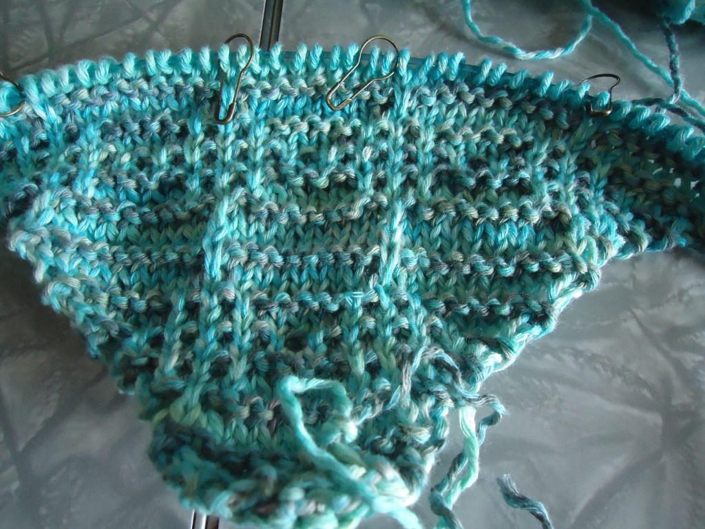
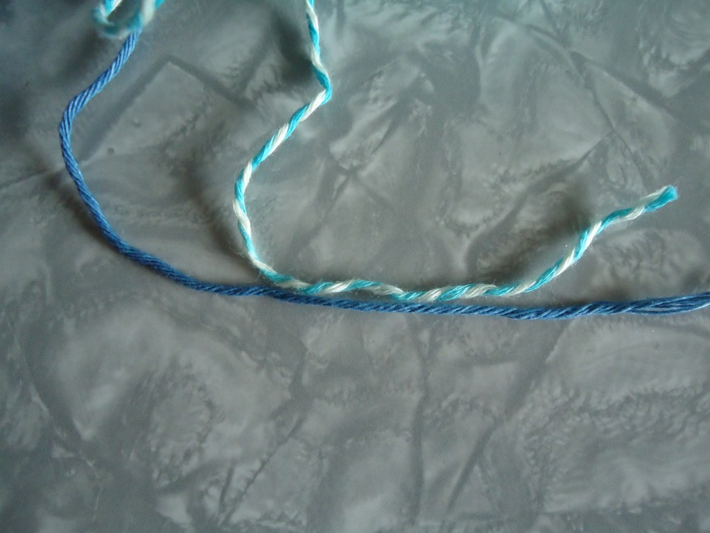
There is nowhere near enough contrast between the two “contrasting color”, and as a result the pattern is nearly invisible. You can see the purl bumps and rows, but nothing else of the design. I tried going a bit father into the ball of contrast yarn, but didn’t find anything much darker at all. After thinking about it overnight, I decided to poke around in my stash and see what I could replace the contrast color with. And came up with the exact amount I need in some old Rowan denim!
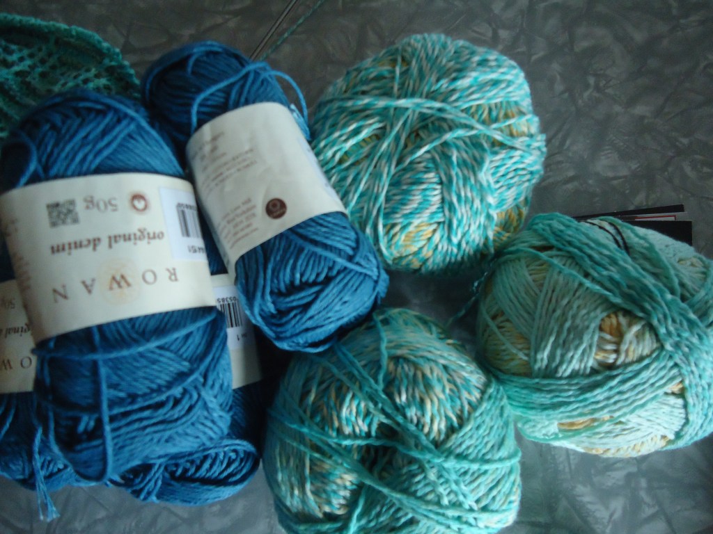
Both yarns are 100% cotton, so that was good. But Rowan denim claims to be worsted weight, while the Crazy Cotton is DK. But looking at strands of them together, they look pretty darn close to me. If anything the denim looks thinner than the Crazy Cotton.
So I decided to go for it and see how it worked
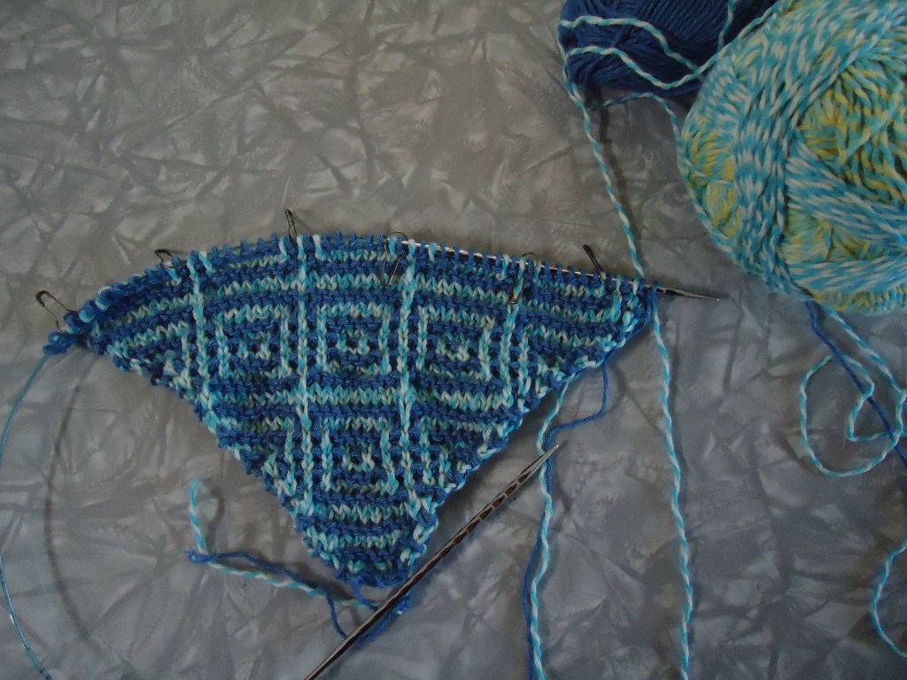
The color doesn’t look as ethereal as the first combination, but you can definitely see the pattern. Much better! And the stash saved the day 🙂

This looks great, but I know that Rowan denim often grows when washed and the colour can bleed too – though maybe not so much with this light shade. I can’t help thinking that you should give this a good soak before knitting any further just to make sure.
LikeLiked by 1 person
That is an excellent notion – thank you! It is going in for a soak right now 🙂
LikeLike
I see the words Franklin Habit and I expect to see Dolores! It’s like a Pavlovian response 😂. Where the heck is Dolores, is she all set for Easter? The first photo I’m not able to see any differences in colour at all on my screen, but the second attempt it’s very clear and it looks great.
LikeLiked by 1 person
Oh I know – me too 🙂 Dolores does not have a new Easter outfit, and believe me I am hearing about it! I have to get back on producing some new dresses for her!
Thank you – I’m glad I had something that would work as a contrast color for it 🙂
LikeLiked by 1 person
Beautiful and nice sub! 👍
LikeLiked by 1 person
Thank you!
LikeLiked by 1 person
Hard to believe they are the same pattern.
LikeLiked by 1 person
Yes -big difference!
LikeLiked by 1 person
Beautiful!! It is amazing how different it is with different yarn.
LikeLiked by 1 person
Thank you! Yes, it makes a big difference!
LikeLiked by 1 person
Oh my gosh, you did the right thing. It looks so much better with higher contrast. I’m impressed with your stash use.
LikeLiked by 1 person
Thank you! I am just thrilled I had something that would work! You know how it is with stash substitutions – you always have not quite enough or not quite the right weight or something 🙂
LikeLike
I think it’s good you switched– that’s such a cool pattern and I couldn’t see it at all in the first one! See, there’s a good reason we feed the stash!!
LikeLiked by 1 person
Thank you! Yes, it is a nifty pattern – when you can see it 🙂 Absolutely – viva the stash!
LikeLike
Beautiful!!
LikeLiked by 1 person
Thanks!
LikeLike
Much better contrast with the Rowan, but I’m wondering: Would you get a nice ethereal contrast if you started at a different point in the second Zauberball? Inside vs outside, maybe?
LikeLiked by 1 person
I wondered the same thing, but i went quite a ways into the second color and didn’t see much darker yarn, so possibly? But then will I wind up franken-knitting bits of yarn together throughout the whole thing? I’ve been second guessing myself all day. I just really wish they had sent me darker contrast skeins with the kit
LikeLike