Find Your Fade is in timeout for a little bit. Just too much garter for too long. I finished the section I was in, but need a little recovery time before I go back in.
I’ve been wanted to try out mosaic knitting, so found a cowl pattern that has been in my library for a while, Colorshift Mosaic Cowl. I fished around in my stash for yarn and came up with some interesting combinations. I have just bunches of miniskeins, and fortunately this pattern works with that need.
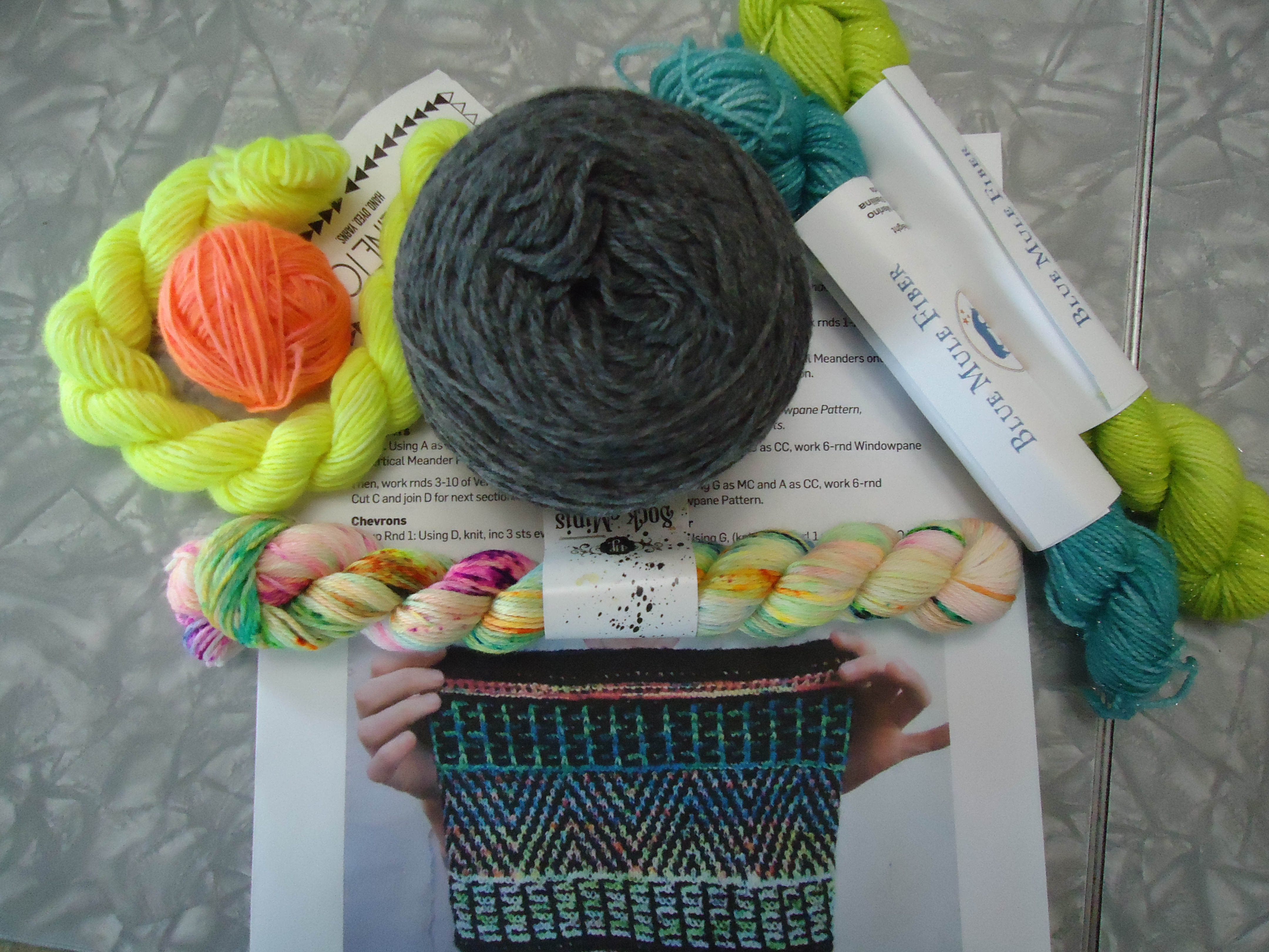
The gray is good for the neutral/background color, and I like the Hedgehog fibers mini right under it for the central section, but had trouble deciding what to put with it.
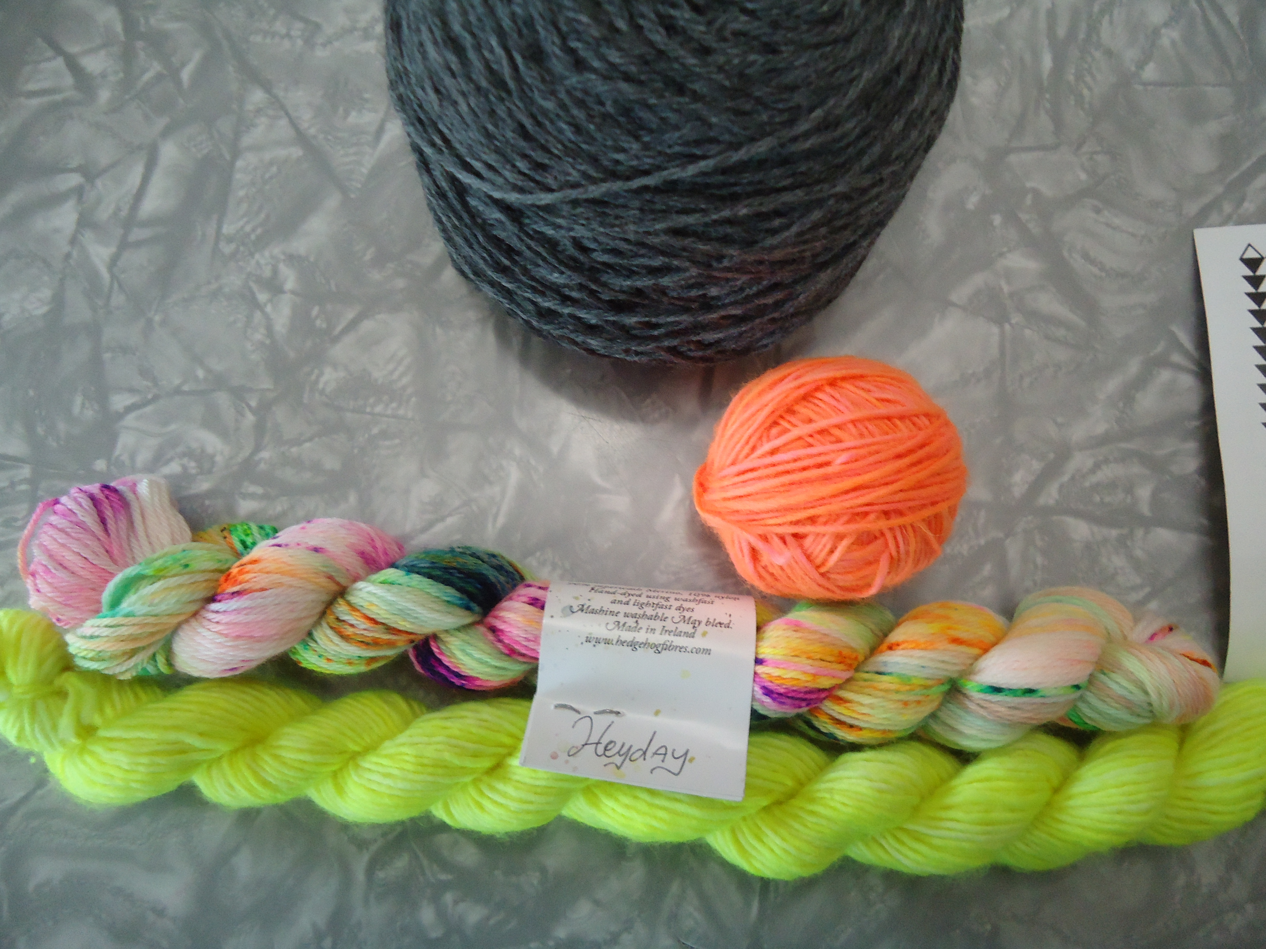
Option 1 is to add 2 Madelinetosh unicorn tails minis – Neon Peach and Edison Bulb. This is a super bright combo. It definitely stand out against the gray, and both go with the central variegated mini.
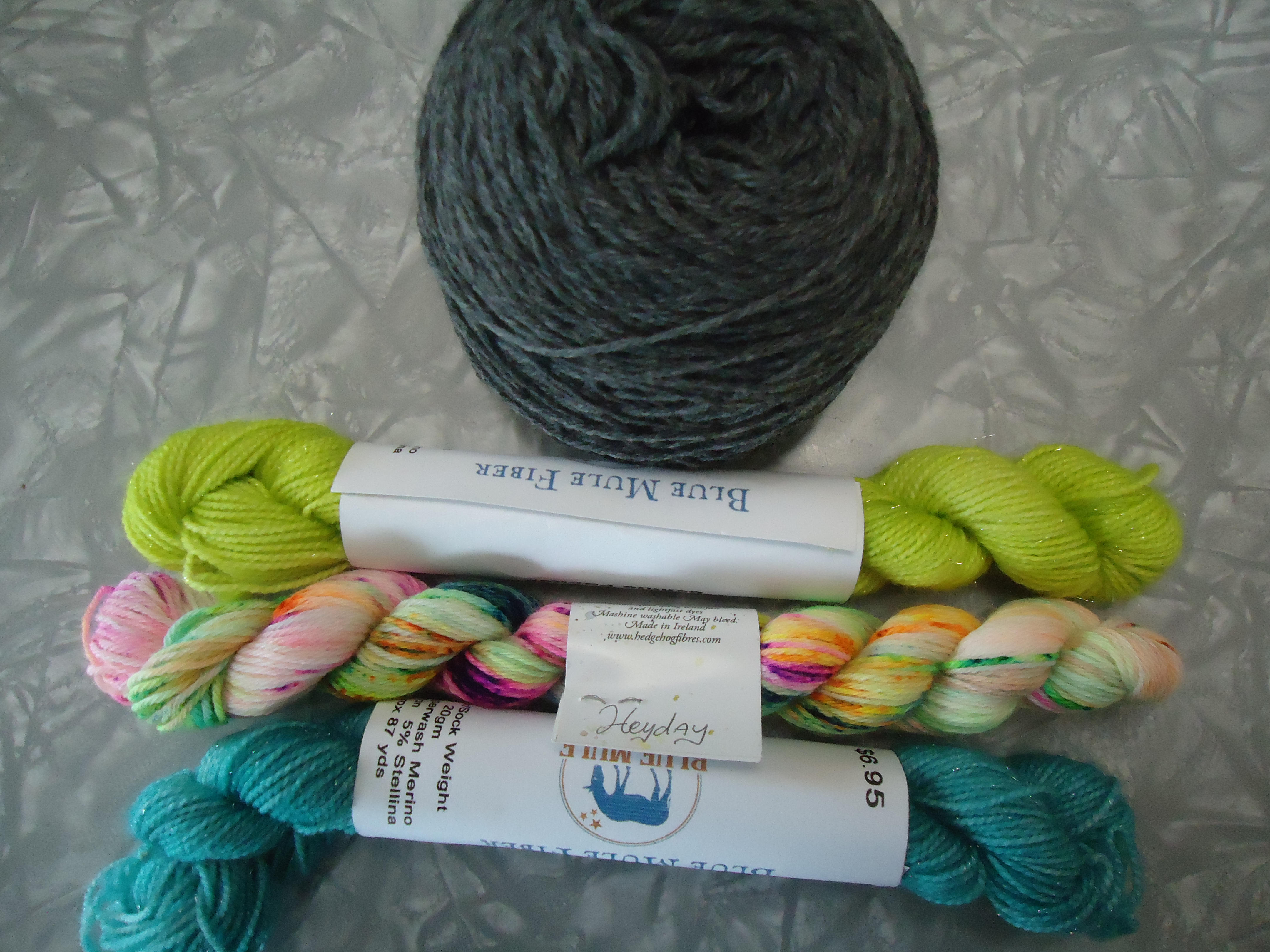
Option 2 is a little bit calmer. The Blue Mule Fiber minis are also sparkly, though it’s hard to pick out in the picture. I was a little concerned the blue wouldn’t be different enough in value from the gray, but in a black & white picture it is different enough. It’s interesting how different the variegated skein looks depending on what is with it. I was poking around my stash for some pink, but that’s not a color I have a lot of.
I’m leaning toward option 2. Have a preference? Feel free to share below!

I also prefer option 2, although it is challenging for me to see what the yarn will look like in situ.
LikeLiked by 1 person
It is always difficult until it’s actually in process – true!
LikeLiked by 1 person
I vote for bright option 1!
LikeLiked by 1 person
I really like option 1. I think the bright colors will work with with the gray. That being said, I’m 90% sure if I was making it for myself I would go with option 2 because it is calmer and I am scared of knitting with bright colors.
LikeLiked by 1 person
That’s pretty much exactly where I am with it 🙂
LikeLike
I’m going off the board and selecting option 3:) How about using the orange and blue? Would that work?
LikeLiked by 1 person
It might! That’s definitely an idea!
LikeLiked by 1 person
I like option 2 better as I feel like having all bright might compete too much
LikeLiked by 1 person
That is a lot of brightness, definitely!
LikeLiked by 1 person
I love #2, but what about wrapping a few strands of each around a yarn stick and see how they play together. Start with the dark, add a color, more of the dark, add 2nd color, and so forth. That way you will see how much difference in value there is. Sometimes the value will change when it’s a smaller amount.
LikeLiked by 1 person
Very good point! Will try that 🙂
LikeLike
Option 2 is my choice. Colors seem to flow better. Sorry ‘Find Your Fade’ was causing boredom. That is a lot of garter though.
LikeLiked by 1 person
Thanks! LOL – yes, it is a lot of garter. I have to just power through it. And eventually I will 🙂
LikeLike
So I am a bit bias as I’m not a fan of orange so instantly thought option 2…however, option 1 really does make the speckled fibre come to life and if ever there was a project to use a neon orange perhaps against a lovely grey is a perfect opportunity? Oh my! Am I really preferring the orange (peach)! That’s so unlike me.
LikeLiked by 1 person
LOL! I am generally not an orange fan either. But it does work in this situation 🙂
LikeLiked by 1 person
I’m not quite sure but think I prefer option 2.
LikeLiked by 1 person
Thank you 🙂
LikeLiked by 1 person